Event Poster Advertisements
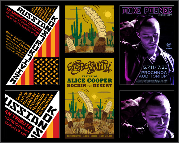
This image showcases my three favorite poster designs. The concept behind the Russian Constructivism poster focused on the artistic style of that era. Russian Constructivism was all about angles, geometric shapes, superimposed imagery, and vibrant colors. This poster is an example of typographic design.
The idea behind the fictitious Aerosmith concert poster was a rock concert in the desert with special guest Alice Cooper. I envisioned a design that was nothing like a traditional rock concert poster. The goal was to illustrate imagery that is representative of the venue's location as well as the concept behind the rock concert. This poster is an example of illustrative design.
The Mike Posner concert poster was designed to reflect the artist's musical genre. I worked with the artist's promoters to create a design that would appeal to the target audience—college girls who enjoy pop music and dance clubs. The promoters provided a grayscale photograph of the artist, so I added a neon color palette to ensure that the poster would stand out from a distance. This poster is an example of photographic design.
Arizona Up Close Photography Book
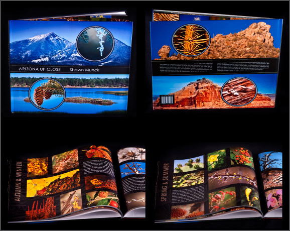
Arizona Up Close is a macro photography book that showcases the patterns, textures, and colors that create Arizona's diverse landscapes. Unlike a typical travel photography book, Arizona Up Close focuses on the smaller details that make up the well-known landscapes of Arizona.
I was deeply inspired by photographers Jack Dykinga and Ansel Adams. I photographed all of the images within the book except the wildlife section, which was purchased stock images. I also designed the book's layout and wrote all of the content. My goal with this book is to have viewers see nature with a new perspective.
Osprey Packs, Inc. Logo & Brochure
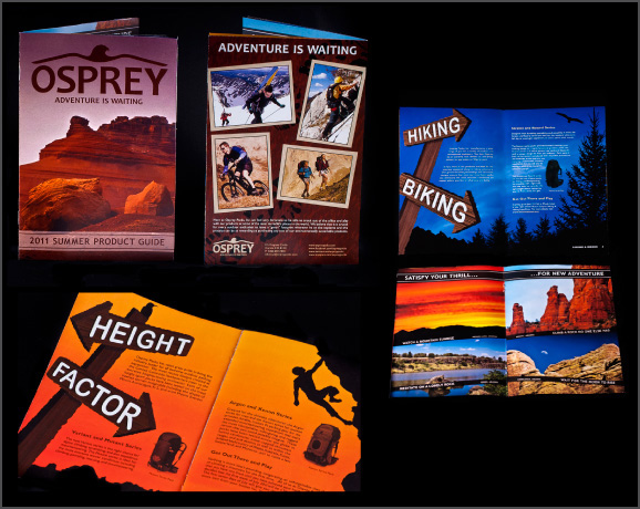
Osprey Packs, Inc. is an outdoor product manufacturing company that specializes in packing products. This project focused on a potential redesign for the company's brand identity in the form of a new logo mark, business identity system, and product brochure. For the logo, I developed a mark that represented the company's dedication to sustainability.
For the brochure, the concept was to combine photographic and illustrative imagery that highlights the excitement of outdoor activities. I was able to photograph all landscape images featured within the brochure. The other photographs are purchased stock images.
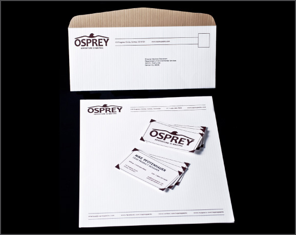
Osprey Packs, Inc. Business Identity System
The goal with this project was practicality, simplicity, and versatility. The company's business system is utilized across the globe, so all design elements needed to be represented in different languages. To emphasize the company's dedication to sophisticated, modern product design, every business card, letterhead, and envelope was printed with the Neenah Classic Columns series.
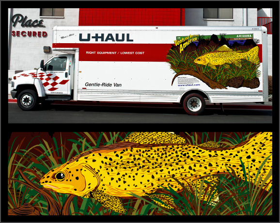
Uhaul Truck Illustration Graphic
I have always been fascinated with the illustrations featured on the sides of Uhaul moving trucks. I created an illustration that highlights an interesting fact about one of Arizona's state symbols. The Apache trout—Arizona's state fish—can only be found within the cold, mountain streams of Arizona. For years, it was one of the top endangered species throughout the world.
From a design perspective, I wanted the fish to be visually dominant over the rest of the illustration. I overlapped certain elements to create a sense of depth and implemented a high-contrast color palette. My goal was to replicate the appearance of actual Uhaul truck illustrations.
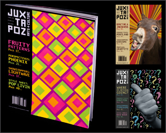
Juxtapoz Magazine Front Cover Redesign
Juxtapoz is an arts and culture magazine that introduces underground art movements to the mainstream public. Juxtapoz's target audience is young adults with creative aspirations. The project focused on the potential redesign of the magazine's logo, front and back covers, table of contents section, and interior spreads.
For this project, I obtained artwork, photographs, and content from several outside, secondary resources just like a publication designer would do in a real-world situation. This image shows three examples of front cover designs. I based the cover's appearance and style off the magazine's featured article.

Juxtapoz Magazine Interior Spread Redesign
The concept was to create a layout design that reflected the work displayed throughout the magazine—edgy, unconventional, energetic, and inspiring. The redesign was intended to emphasize the work and not overpower it. Since the work is very colorful and dynamic, I chose a black background to help the work stand out and grab the viewer's attention. The subdued, gray text is easier on the viewer's eyes than traditional bright white text.
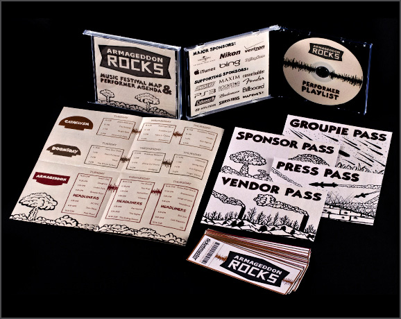
Armageddon Rocks Music Festival Collateral
Supposedly the world is going to end on Friday, December 21, 2012. Instead of hiding in our homes, we should celebrate with a huge rock music festival called Armageddon Rocks. In order to promote this event, certain materials needed to be designed—a logo, festival map/performance lineup, performer CD jacket, set of guest tickets, and set of guest passes. The goal was to create a unified look for all collateral by illustrating visual elements associated with Armageddon.
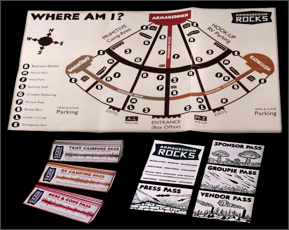
Armageddon Rocks—A Closer Look
This photograph showcases a map of the venue as well as the front designs of the tickets and passes. For the map, I relied on alliteration to showcase different stations within the venue. Relying on different color schemes and illustrations distinguishes the ticket and pass categories.
Environmental Signage Display
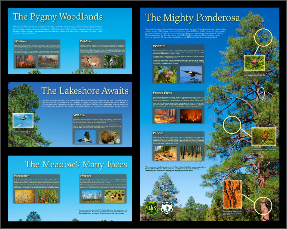
During my tenure as a recreational interpreter/graphic designer with the United States Forest Service, I had the privilege of designing a signage system/interpretive display that included four separate signs. The display educated visitors about the different environments located within an Arizona state park. I worked closely with associates from Arizona State Parks, the United States Forest Service, and the Arizona Game and Fish Department.
I wrote and edited all of the content and photographed most of the images. Other images were obtained through the various government agencies as well as stock photography websites. The final design was approved by a United States Forest Service committee. Visual consistency, legibility, aesthetic appeal, and unity were the ultimate design goals for the project.
Green Canopy Logo & Packaging Design
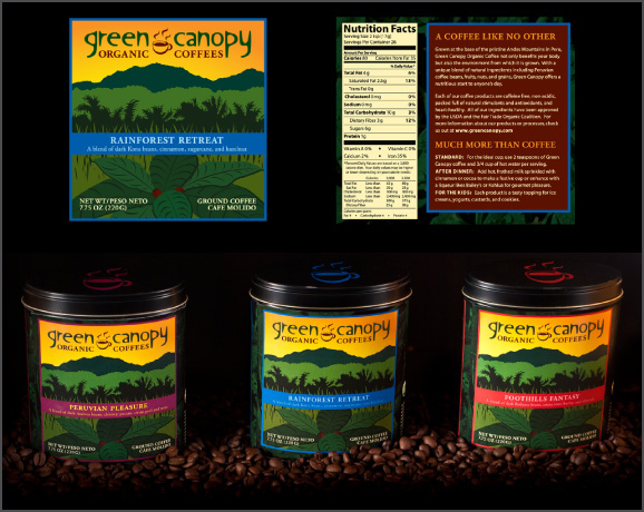
Green Canopy is a fictitious organic coffee manufacturing company based out of Santa Barbara, California. The brand was launched with the release of a logo mark, packaging design, and business identity system. My concept behind the logo was a modern, sophisticated mark that combined elements of the rainforest and coffee.
For the packaging design, I wanted to illustrate the setting where the coffee is grown, which is the foothills of the Andes Mountains in Peru. A red, purple, and blue color palette helps differentiate the product flavors.
Green Canopy Business Identity System
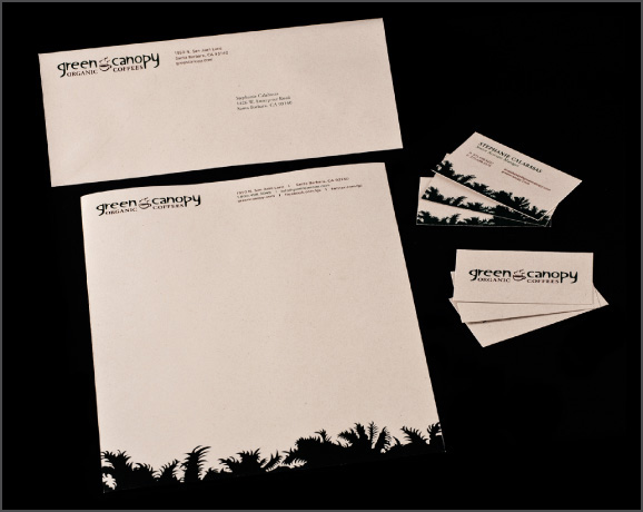
Like any company, a business system must be incorporated into the brand's identity. To establish consistency, I utilized the same colors from the logo for the business system. The success of this project was dependent upon the paper choice. Every business card, letterhead, and envelope was printed with the Neenah Environment series to ensure a rustic, earthy appearance.
Taken—Kinetic Typography
This typographic animation visually narrates a pivotal scene for the suspense thriller Taken, starring Liam Neeson. The typeface I chose was Franklin Gothic Demi because of its clean, geometric appearance and strong, visual presence. I wanted the color palette and motion to show the tension of the movie. For a typographic animation, legibility is key and Franklin Gothic Demi is a very legible typeface, especially when it's in motion. The sound was sampled from the movie Taken strictly for audio purposes.
Self-Promotional Materials
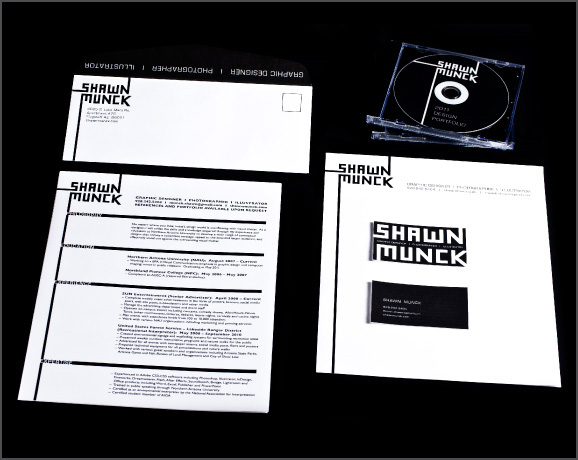
For my self-promotional materials, I created a simple, clean design that could be represented on any type of media—from fax transmittals to webpages. When the self-promotional materials are shown in conjunction with my work, I want my work to take precedence over the self-promotional materials. This is the reason for the stark color scheme and simple design. The set includes the standard business identity system, CD cover, and resume template.